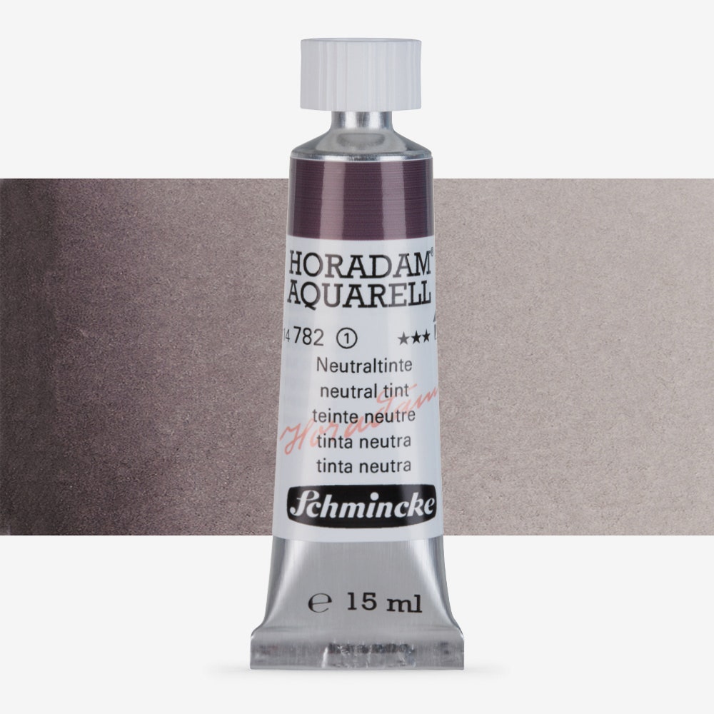
Schmincke horadam neutral tint watercolour
I keep confusing the name of this colour with Schmincke’s “neutral grey”. That grey is colder, more bluish. But this is a kind of purplelish maroon grey. The larger the area, the easier it is to see the colour difference.
I tend to use neutral tint towards the bottom of my artworks to help balance the artworks so that they are not “top heavy”. I don’t normally use this colour to paint specific organs or objects, but to provide more of an overall neutral background so that the rest of the colours can be allowed to ‘sing’.
Related news
Pale erbium oxide pink pigment
Recently I decided to add a new colour to my palette and that is erbium pink (erbium oxide...
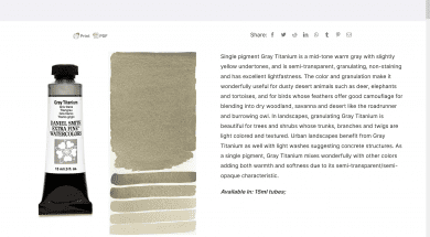
Daniel Smith Gray titanium
Gray titanium is one of those colours that I didn't buy straight away. I was doing fairly ...
Choosing my water colour palette and brands
I thought it would be interesting to say a few words about the brands of paints and pigmen...
Turner's yellow
I'd like to begin my discussion series about the individual pigments that I use with
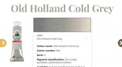
Old Holland cold grey
One of only two Old Holland colours I'm using. I needed a cold grey for my larger works of...