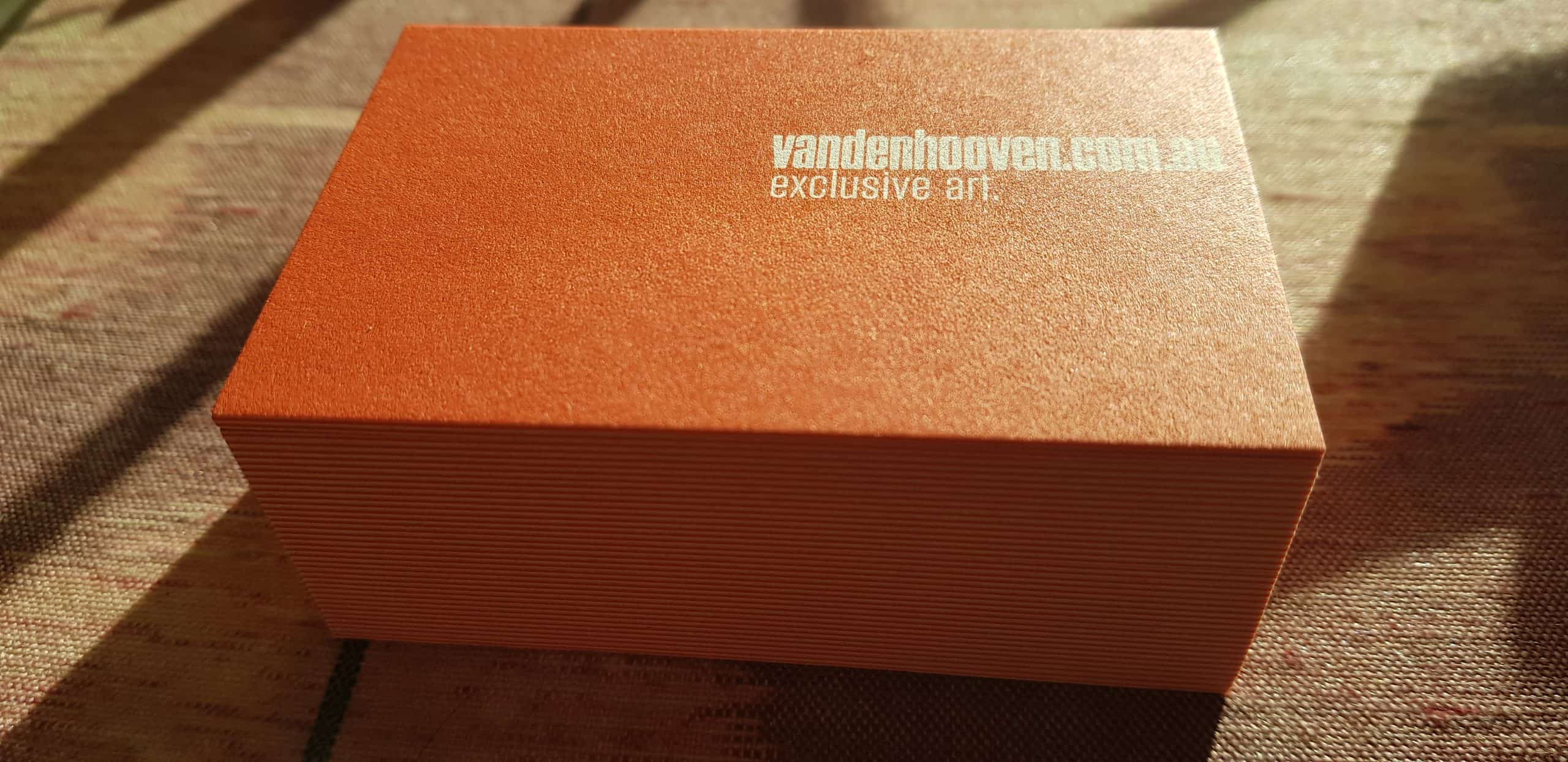
van den hooven business cards arrived yesterday!
The main feature is that they are an extremely minimalist design. The ‘reversed’ text is the colour of the paper and has been “knocked-out” of a large block of orange colour (with matches the website colour scheme of course).
These have a matching orange core (well, I thought it would be close enough – and it is).
There is no phone number, no logo to speak of (the url address is based on the original van den hooven wordmark). There is no email address. There is no physical address. There are no social media icons.
Is any of it really needed? All that is needed is who we are and what we do (and where you can find out more information if you are interested). It’s that simple.
There is no list of products or services. Just a short phrase in lowercase that states “exclusive art”. It’s not even our tagline, which has become “elevate with art”.
I decided that rather than having plain white on the other side, I would simply duplicate the design. Front = back. So it doesn’t matter which way you hand it to someone. If they turn it over they will see the same thing.
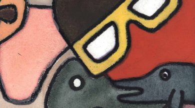
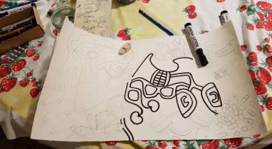
I do not even show a picture of my art. I’d rather not be judged that quickly, on one piece of art. So it’s an open invitation to come and look at this website for more detail about the type of art.
They really do stand out on a noticeboard compared to other more familiar designs. I just tried it today, put some up.
I don’t think I could ever have designed a card like this to be so minimalist without doing a course in graphic design… most people try and fid as much as possible onto their cards. But often less is more.
I got them printed at moo. I only got about 200. I was a little bit worried that the text might not be legible; I’ve heard that with all that ink, it can bleed into the text and you can lose fine details. Anyway, I think they turned out rather well. I am pleased. Although I don’t think orange photographed that well in the afternoon sunlight.
In future I might lower the text so that the corner of the letter ‘v’ in right smack bang in the middle of the card while and also reduce the size of the text ever so slightly so that there is more of a gap on the right hand side.
Related news
I don't actually like the term pop art.
It's true. For one thing, I don't like the word 'pop'. I never just 'pop' down to the shop...
Online art shop website updates
We just wanted to provide a quick update as we're busily working behind the scenes to impr...
Where is your money really going?
When I buy your art, where is my money really going? We're glad you aske...
Colour accuracy during scanning
As we beginning to upload new works, We seem to be having a bit of trouble getting colours...
About illustrative artist Van Den Hooven...
Illustrative artist Van Den Hooven, has a distinct visual langu...