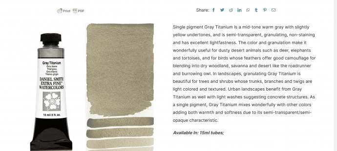
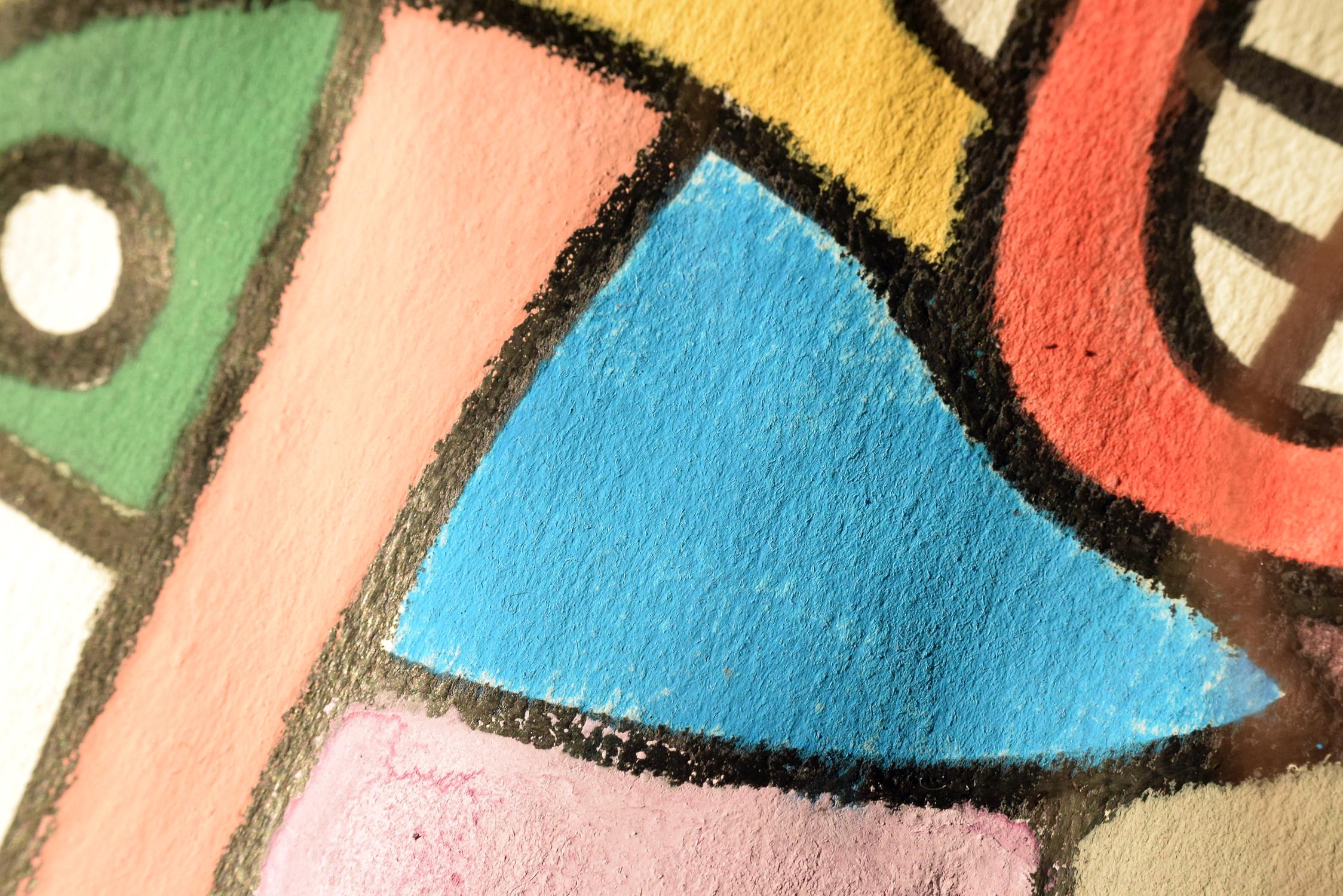
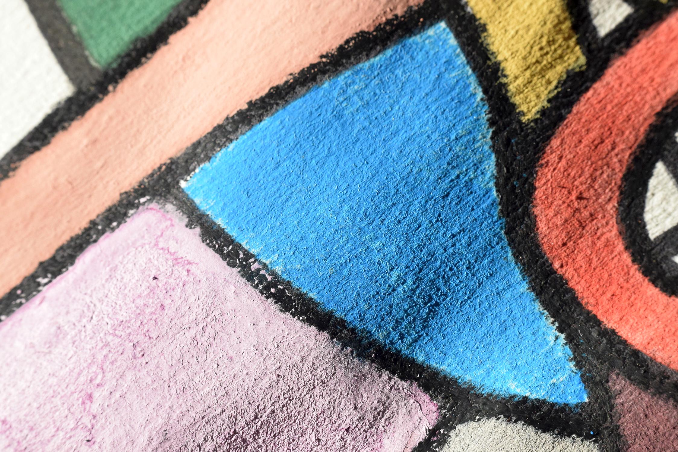
Daniel Smith Gray titanium
Gray titanium is one of those colours that I didn’t buy straight away. I was doing fairly well without it as I had several other greys. But after about a ...
Gray titanium is one of those colours that I didn’t buy straight away. I was doing fairly well without it as I had several other greys. But after about a ...
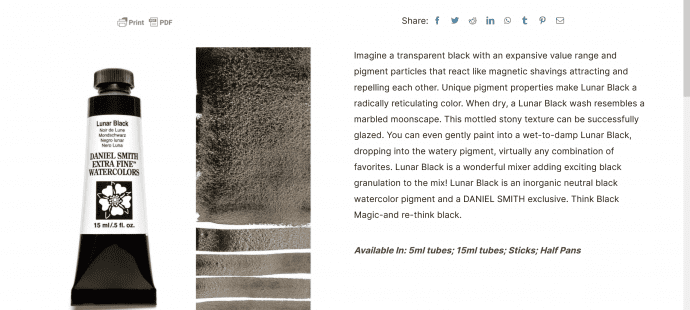
Lunar black was one of the first non-Schmincke colours I tried. Reason being, I felt that the Schmincke blacks were not very black (each of them was quite similar to ...
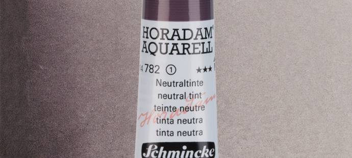
I keep confusing the name of this colour with Schmincke’s “neutral grey”. That grey is colder, more bluish. But this is a kind of purplelish maroon grey. The larger the ...
I thought it would be interesting to say a few words about the brands of paints and pigments that I use, so I intend to do just that. I’ve put ...
Recently I decided to add a new colour to my palette and that is erbium pink (erbium oxide). I’ve been using it for several months already. I believe no one ...
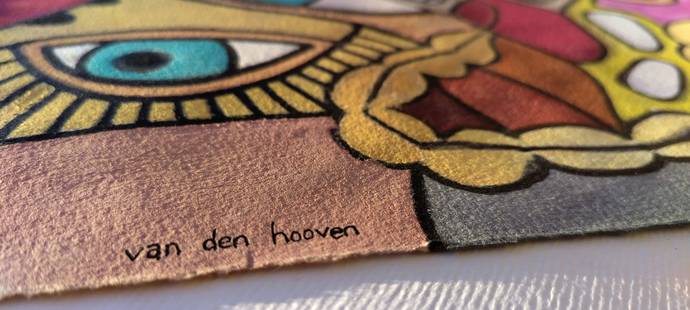
One of the easiest ways to tell is simply to check the colour palette. Because there are certain colours that van den hooven no longer uses. Excluded colours and pigments: ...
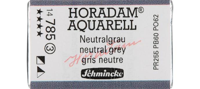
I keep confusing the name of this colour with Schminke’s “neutral tint”. That grey is a warmer, purplelish maroon grey. But this is a kind of colder, much more bluish. ...
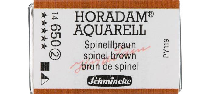
Winsor and Newton calls it “magnesium brown”, but I am using the Schmincke version (which may or may not have magnesium in it). Iron zinc spinel, or PY119, as it ...
I recently started using genuine manganese blue colour, a pigment made from barium manganate sulfate. You can buy my first artwork using this unique and rare pigment here. I’m also ...
One of the other colours in my palette is cobalt violet, but not Schmincke cobalt violet hue. I’m referring to Daniel Smith’s cobalt violet (PV49). It’s a single pigment colour ...
Of all the colours I have struggled with the most, it is probably orange. The reason is that many of the oranges did not seem natural to me, they are ...
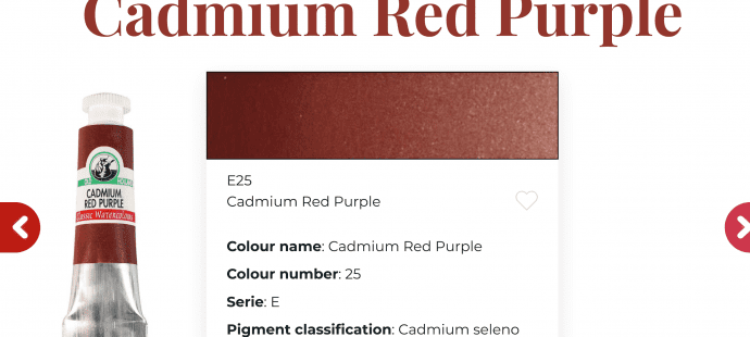
Yes you read right, cadmium purple. There is such a thing. By Old Holland. I was intrigued by the thought of this, so I bought it. And it is indeed ...
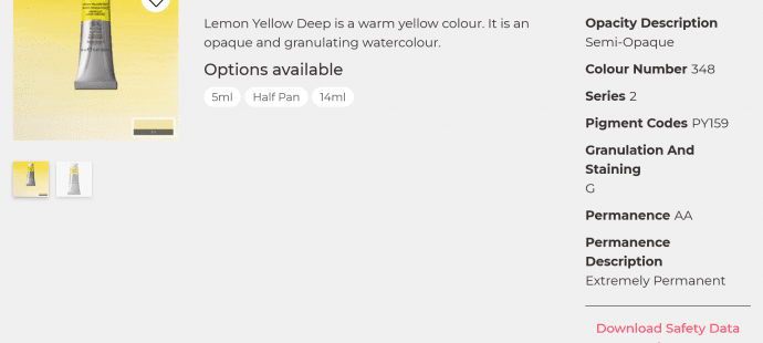
The only Winsor & Newton colour that’s in my palette is their lemon yellow deep. The reason is that it’s a really amazing warmish mid-yellow. Schmincke has nothing like it. ...
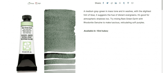
Another Schmincke colour that I stopped using is their #516, green earth. Why? Because along with PBr7, it contains pthalo green PG7 that’s why. Ugh. Daniel Smith’s rare green Earth ...
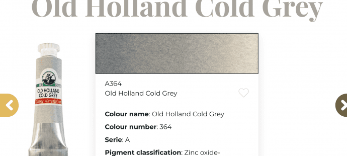
One of only two Old Holland colours I’m using. I needed a cold grey for my larger works of art. I found this and it works. It’s exactly what it ...
Cobalt turquoise (PG50) is one of those colours that I instantly fell in love with. There’s nothing else like it. Nothing comes close. The next closest cobalt colours, cobalt cerulean ...
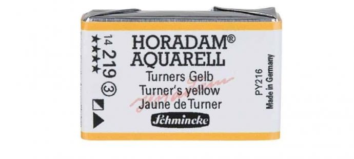
I’d like to begin my discussion series about the individual pigments that I use with Turner’s yellow. I seem to have settled on a number of different yellows and I’ll ...
Page 1 of 1