van den hooven

  • about
    • about
    • embodied energy
    • heritage
  • news
  • art
    • portfolio
    • gallery
    • lightbox
    • archive
  • shop
    • online store
    • online shop
    • commission an artwork
    • cart
    • checkout
    • Saatchi art
    • Bluethumb
  • FAQ
    • support FAQs
    • framing information
    • shipping policy
    • refunds & returns
    • links
  • blog
    • blog
    • colours
    • organs
    • objects
  • contact
  • 0 items$0
The brain.

The brain.

vandenhooven 23 December 2023

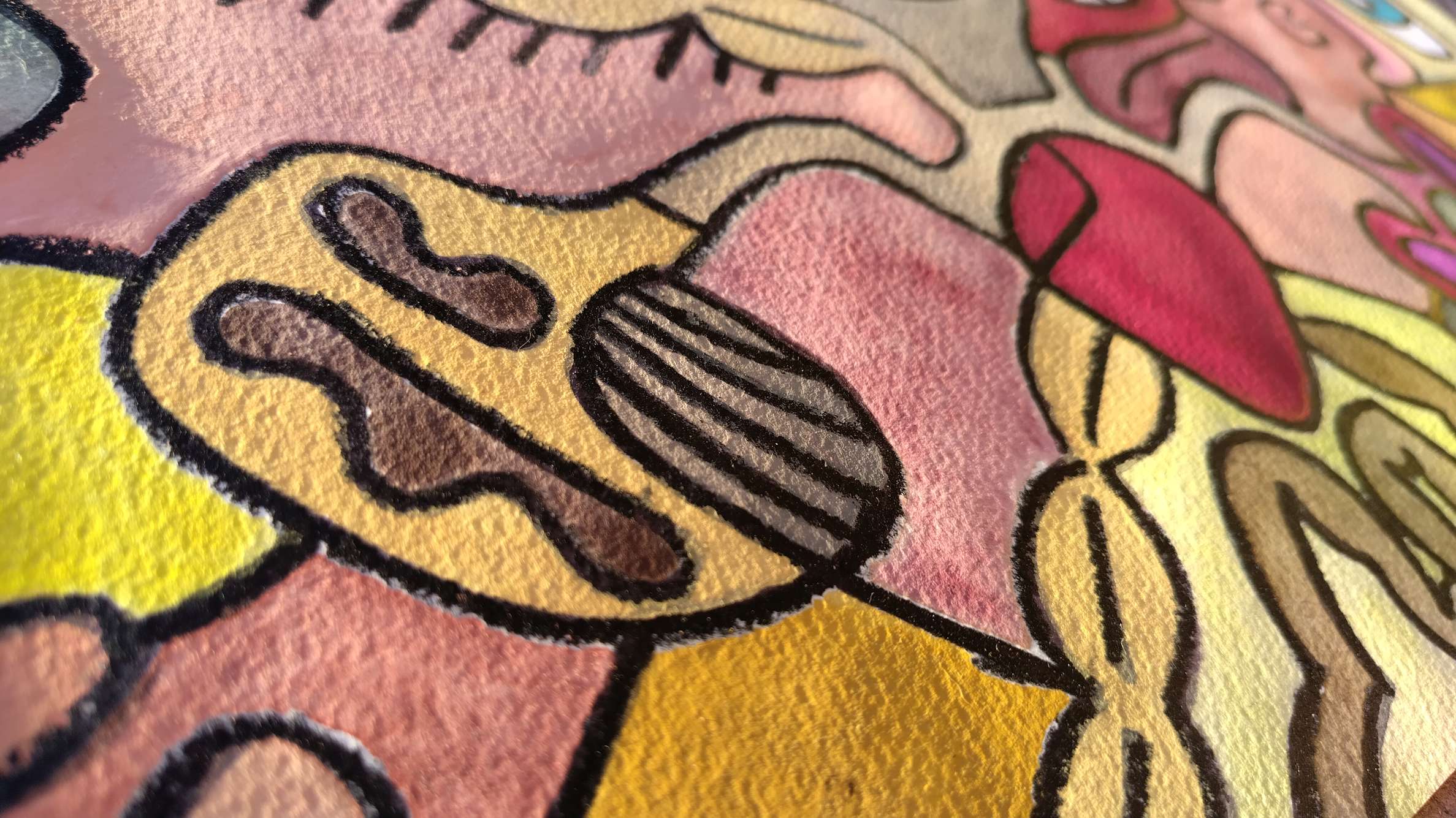
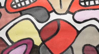
I’ve always thought brains reminded me of walnuts (or rather, walnuts reminded me of brains) and so I draw the whole corpus callosum (a) in the shape of a walnut (in Schmincke’s walnut brown I might add). A bit of a stylised brain. A logobrain. Because I can. Because that’s my background. That’s who I am. That’s what you call “artistic license”.

Today I searched for pictures of brains. It wasn’t that easy to find a picture of a real human brain. Or rather, it wasn’t that easy to find a picture of a real human brain that wasn’t discoloured due to being stuck in some preservation fluid for years on end.

vintage brain medical illustration cross-section corpus callosum engraving

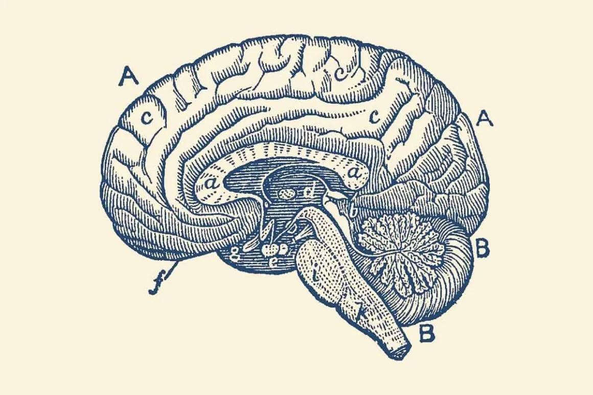
It turns out (from what I could discern with a brief online search with google) that the cerebellum (B) and the cerebrum (A) are approximately the same colour.

Despite that, I still paint my cerebellums darker than the cerebrums (these days). Mainly because I’ve been doing it that way for months already and I’m not changing my style now.

In case you are wondering, I usually paint the brains naples yellow (probably because that’s how they look after they’ve been sitting in preservation fluid for years on end. Almost colourless, but yellowish. I paint the cerebellum gray titanium. Well, sometimes the brain is called “grey matter” isn’t it? I feel the grey colour* has to be represented somewhere!

Lately I have been painting the cerebellum stripes at a different angle (as it is almost looks like a danger zone that way if you must know), and leaving it plain white to give the artworks more negative space and hence contrast overall.

I think my brains look better this way. There is more contrast. Perhaps if you ask a neurosurgeon (one that is cluey about colours) they might even be a slightly different colour? They do have different types of cells to the rest of the brain after all… it wouldn’t surprise me.

What I did find was that I wasn’t drawing the brain stem (which includes the pons, the midbrain and the medulla oblongata). So I might start including them in my depictions of brains in future. I think it’ll be more recognisable as a brain, and that’s what I want.

* Or maybe it is white matter?

Tagged: brain, cerebellum , danger zone , naples yellow , organs , painting , walnut brown

Related news

How did van den hooven's style arise?
04/07/22 0 2540

How did van den hooven's style arise?

What I call the van den hooven style did not happen quickly. It has evolved slowly, over a...

The lungs
24/10/24 0 459

The lungs

Another organ that I like to paint are a pair of lungs. I tend to paint these in a triangu...

The heart
26/10/24 0 1536

The heart

The hearts are often the centrepiece of my artworks. Did you know that the word for 'heart...

Search
News
  • Announcing the inaugural art exhibition of emerging artist van den hooven at Clyde Gallery, Bay Pavilions Art+Aquatic, Batemans Bay!
  • My story. My love story. My struggle as a starving artist.
  • Would you like to leave this humble artist a google review or other feedback? 🙏
  • The meaning behind my art, what inspired it, and what I like about it.
  • Schmincke neutral grey
Categories
  • art
  • colours
  • hearts
  • me
  • news
  • objects
  • organs
  • presentation
  • progress / process
  • reviews
  • shop
  • Uncategorised
Keywords
about abstract and art artist artwork cadmium cadmium purple cards cobalt cobalt violet colour colours cryptocurrencies? erasers form grey marks new news Old Holland online orange organs paper pencil pigment praseodymium yellow presentation presentations process progress red review reviews Schmincke shop staedtler style uncategorised van den hooven Van Gogh vermillion website yellow
Sitemap
  • About van den hooven
  • Art and Design Organisations
  • Blog
  • Cart
  • Checkout
  • Commission an abstract artwork.
  • Contact
  • Embodied energy of excess
  • Framing information
  • Gallery
  • Home
  • Lightbox
  • News
  • Online store
  • Order tracking
  • Portfolio
  • Shipping policy
  • Support FAQs
News
  • Announcing the inaugural art exhibition of emerging artist van den hooven at Clyde Gallery, Bay Pavilions Art+Aquatic, Batemans Bay!
  • My story. My love story. My struggle as a starving artist.
  • Would you like to leave this humble artist a google review or other feedback? 🙏
  • The meaning behind my art, what inspired it, and what I like about it.
  • Schmincke neutral grey
Contact

van den hooven
98 Mountain View Road
Moruya NSW 2537
Australia
+61 497 889 998
ABN: 42 419 099 435

van den hooven

Illustrative artist van den hooven has a distinct visual language characterised by confident lines, divergent colours and imbued with vibrant symbolism.

Intentionally cluttered, contradictory and complex—his compositions capture the chaos of the modern world, through deconstruction and rearrangement of the internal and external and the animate and inanimate.

van den hooven © 2025.    Logo by logobrain.    Website by thelastpistachio.com

This website uses some cookies. By continuing here, you agree to their use.

More information

Your amount to pay has been updated
The previous conversion quote has expired. Here is your new quote:
Total
$
You Pay
Back to checkout
Place Order
0